Project Description
The strongest path to creating an authentic sense of place is through local crafts and materials – Porto Airport utilises the best of the proud Douro region to develop a sense of place that is proudly Porto.
ANA Airports (part of the Vinci Airports group) wanted the retail design of the new 1500 sq m extension of the departures commercial zone at Porto Airport to create a distinctive sense of place that expressed a true flavour of the city and the Douro region.
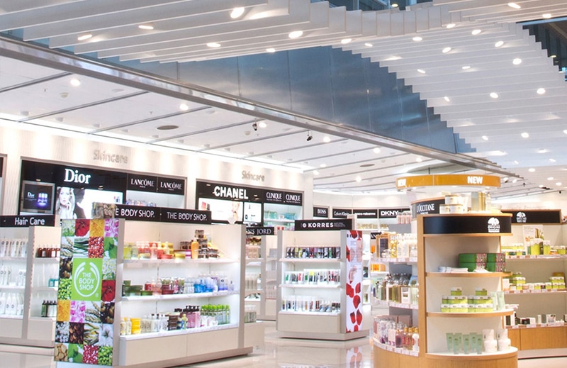
The new space incorporated a walk-through duty free store, doubled in size from the original version to 940 sq m, and was reconfigured to expand the proportion of sales area and significantly enhance the amount of natural light.
The central feature of the new store, “Taste of Portugal”, presents a shopping zone dedicated to a wide range of regional foods, with a powerful visual Sense of Place that emphasises the location through the use of new and reclaimed local materials, local lighting design and a palette referencing the region’s wine and port production, the ubiquitous cork tree and the iconic blue and white Azulejo Portuguese tile.

Stained burgundy corks arranged end-on fill white metal canister letters that are pin-mounted off the contour ceiling raft giving a floating appearance to the fascia lettering.

In the wine section, Douro Valley wine regions and grape names are written on the underside of the service duct in a distressed style typeface echoing traditional port bottle labeling. Bespoke ceiling finishes allow for a unique feel to each of the core category areas with feature use of wine and port crates.

“Our biggest passion and driving force for every project we work on is creating an authentic sense of place, unique to each location. For Porto our inspiration came from the undulating landscape of the Douro Valley which we have translated into several aspects throughout the store, and noticeably into a bold, feature ceiling, working creatively around the infrastructure of the terminal to disguise essential services – which so often dominate airport environments – making for an attractive view into the store that invites shoppers on an attractive journey through the core categories.”
Nick Taylor, Director of Design, The Design Solution

The store takes inspiration from Porto and the Douro Valley, offering Sense of Place. The store’s ceilings are said to reproduce the forms of vine terraces or evoke casks and Port wine boxes. The walls and furniture reference the colour of Port wine, while other design elements make use of cork and the art of Azulejo ceramic tiles.


